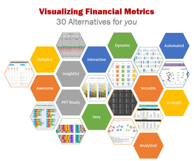
Around 2 months back, I asked you to visualize multiple variable data for 4 companies using Excel. 30 of you responded to the challenge with several interesting and awesome charts, dashboards and reports to visualize the financial metric data. Today, let’s take a look at the contest entries and learn from them.
First a quick note:
I am really sorry for the delay in compiling the results for this contest. Originally I planned to announce them during last week of July. But my move to New Zealand disrupted the workflow. I know the contestants have poured in a lot of time & effort in creating these fabulous workbook and it is unfair on my part. I am sorry and I will manage future contests better.
How to read this post?
This is a fairly large post. If you are reading this in email or news-reader, it may not look properly. Click here to read it on chandoo.org.
- Each entry is shown in a box with the contestant’s name on top. Entries are shown in alphabetical order of contestant’s name.
- You can see a snapshot of the entry and more thumbnails below.
- The thumb-nails are click-able, so that you can enlarge and see the details.
- You can download the contest entry workbook, see & play with the files.
- You can read my comments & suggestions for improvements at the bottom.
- At the bottom of this post, you can find a list of key charting & dashboard design techniques. Go thru them to learn how to create similar reports at work.
Thank you
Thank you very much for all the participants in this contest. I have thoroughly enjoyed exploring your work & learned a lot from them. I am sure you had fun creating these too.
So go ahead and enjoy the entries.
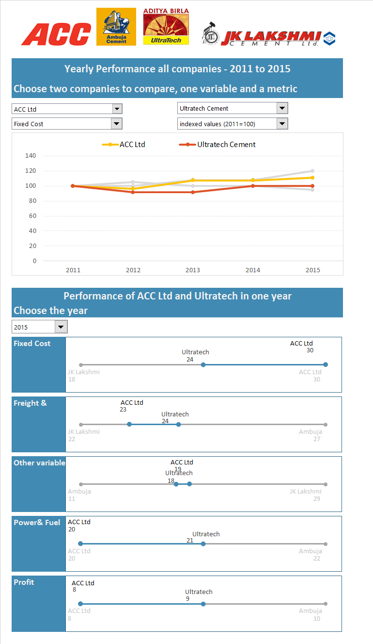
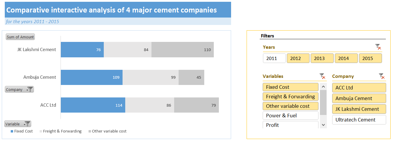
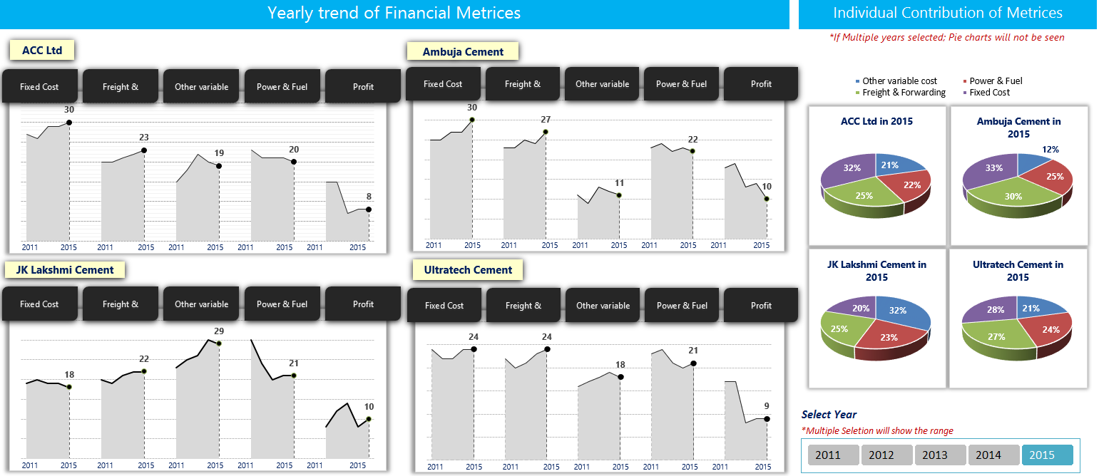
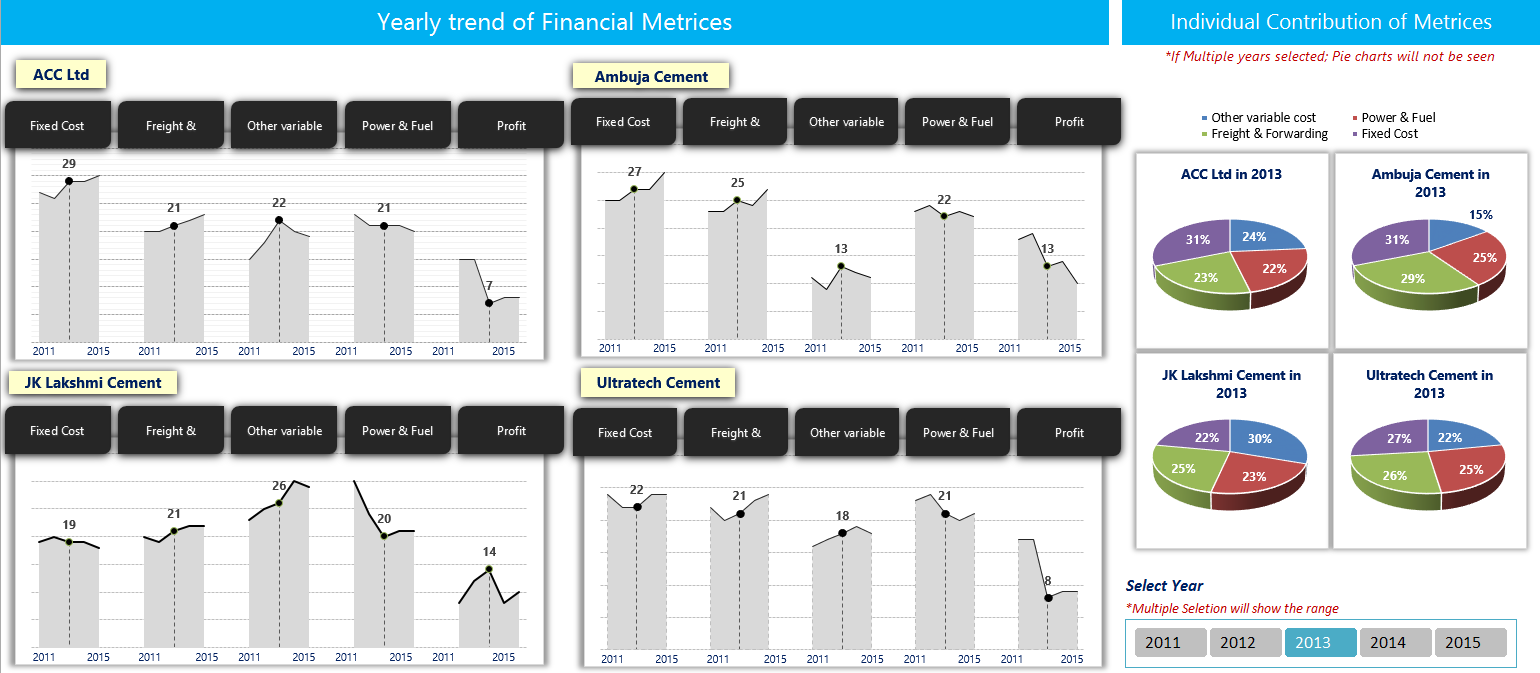
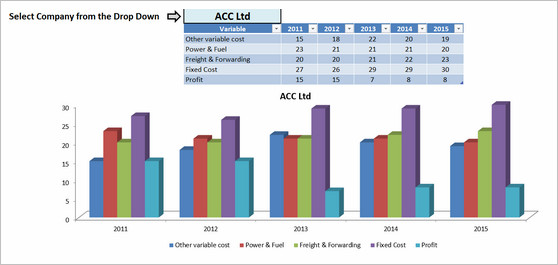
Dashboard by Abhay
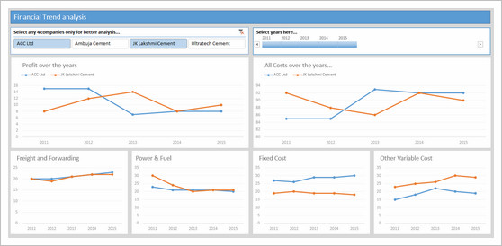

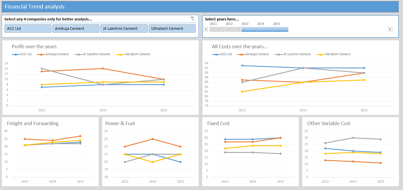
- Interactive dashboard
- Dynamic, can add years and companies. Built with Power Query.
- Simple and easy to read layout
- Can add % changes for top & bottom companies
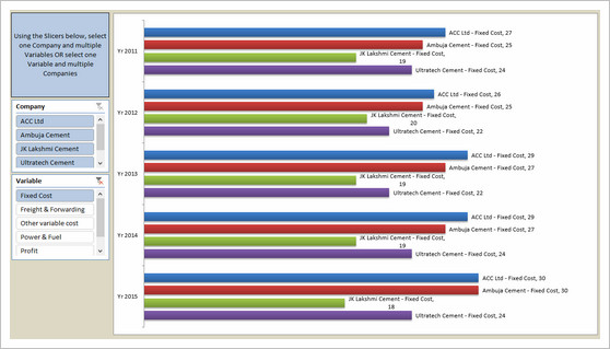
Interactive Chart by Akongnwi
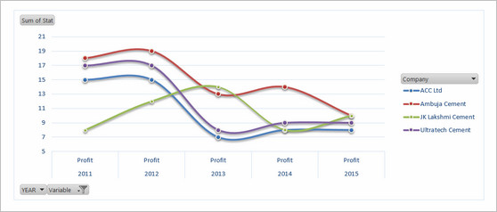

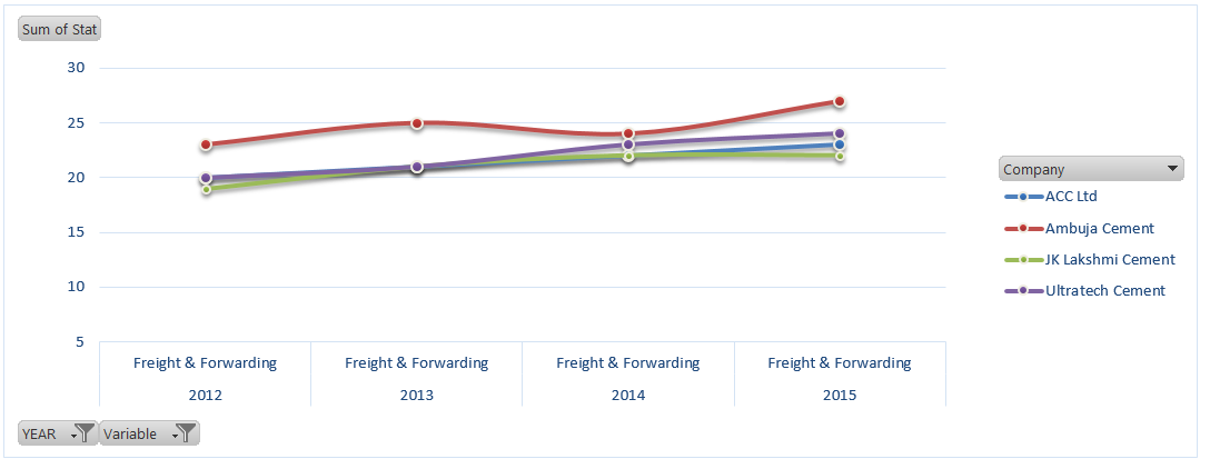
- Dynamic pivot chart
- Could have used regular line chart. Smoothed chart creates wrong impression.
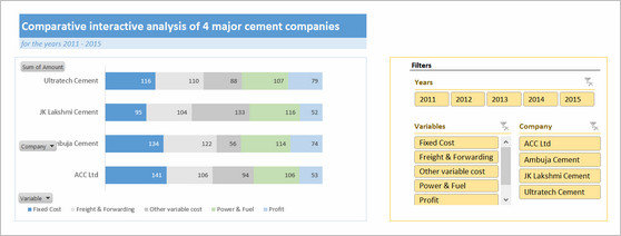
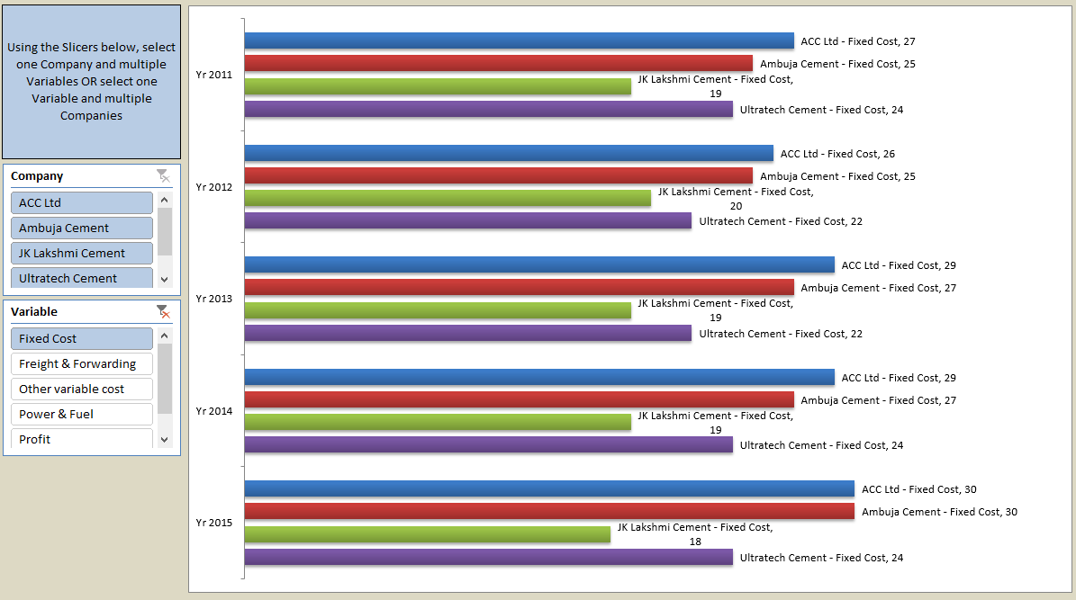
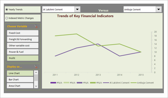
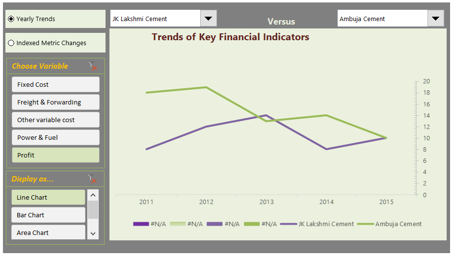
Interactive Chart by Alex
- Interesting layout and execution
- Allows various comparisons
- Can add labels to the bars.
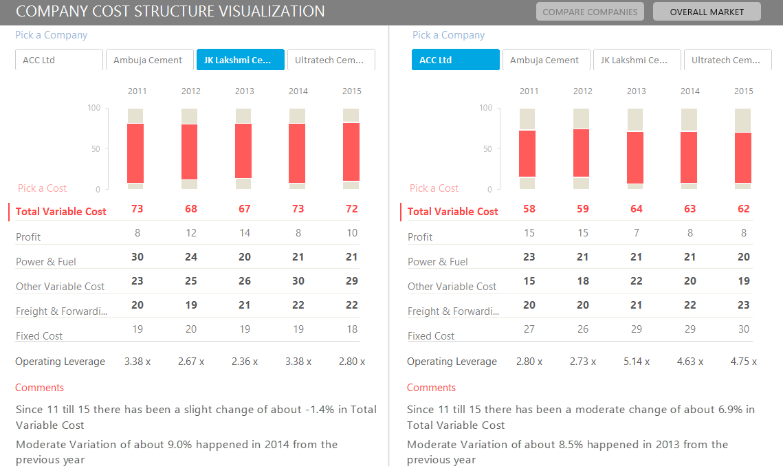
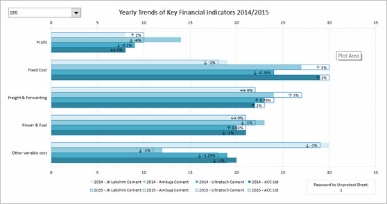
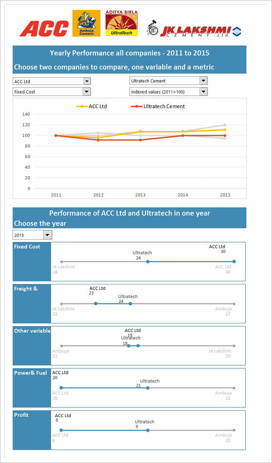
Interactive Chart by Arnaud
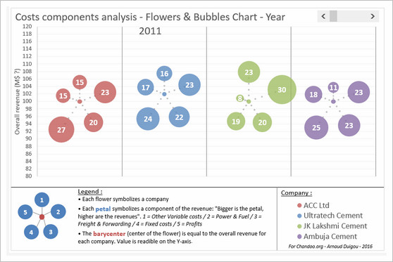

- Interesting layout and story telling
- Allows various comparisons
- Can be a bit hard to understand as there are few labels
- Could have added another set of bubbles (or just labels) to compare previous year’s values
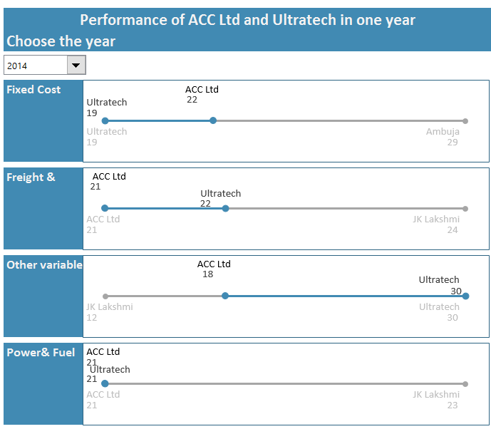
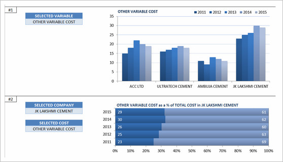
Dashboard by Chandeep


- Awesome design and analysis
- Offers additional metrics and comparisons
Interactive Chart by Chirayu


- Interactive chart to analyze financial performance YoY
- Simple and easy to read
Dashboard by Edouard
- Interactive dashboard with lots of comparison options
- Very cool line chart with relative performance
- Could have re-arranged to fit on one screen. Feels too long.
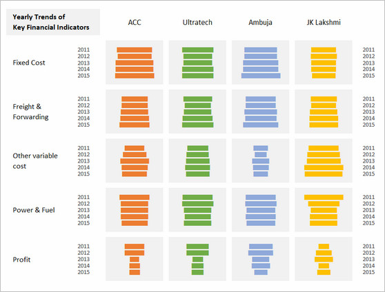
Chart by Edwin
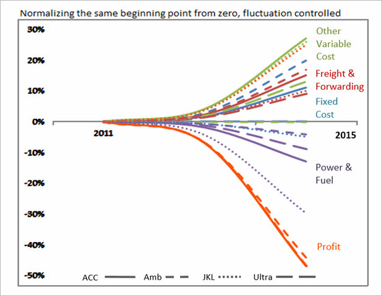

- Very interesting normalized chart
- Can be hard to read. Could have added explanation.
Interactive Chart by Elchin

- Interactive charts
- Simple and easy to read
- Could have removed the filtering buttons from pivot chart
Chart by Emlyn


- Multiple charts to visualize various trends
- Simple and easy to read
- Can add some insights (% changes etc.)
Become Awesome in Excel & VBA – Create dashboards like these…
- Learn how to create interactive dashboards & reports using Excel
- Develop your own macros & VBA code
- 50+ hours of video training
- Learn at your own pace
- Click here to know more
Interactive Chart by Erik


- Interactive dashboard
- VBA driven, allows multiple selections & comparisons
- Few errors and alignment issues
- Can add commentary on what metrics / companies are important.
Chart by Gareth

- Simple and easy to read panel chart
- Could have highlighted trends that are important
Chart by Gerald
- An elegant presentation of profit vs expenses data
- Very good colors and easy to read
- Could have added ability to sort by latest figures for a selected metric. This can expose key trends easily.
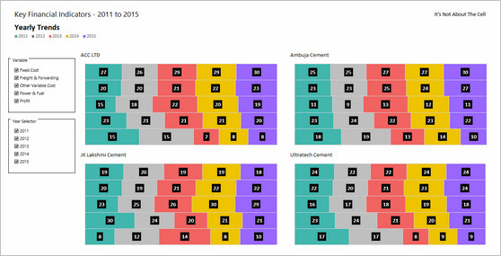
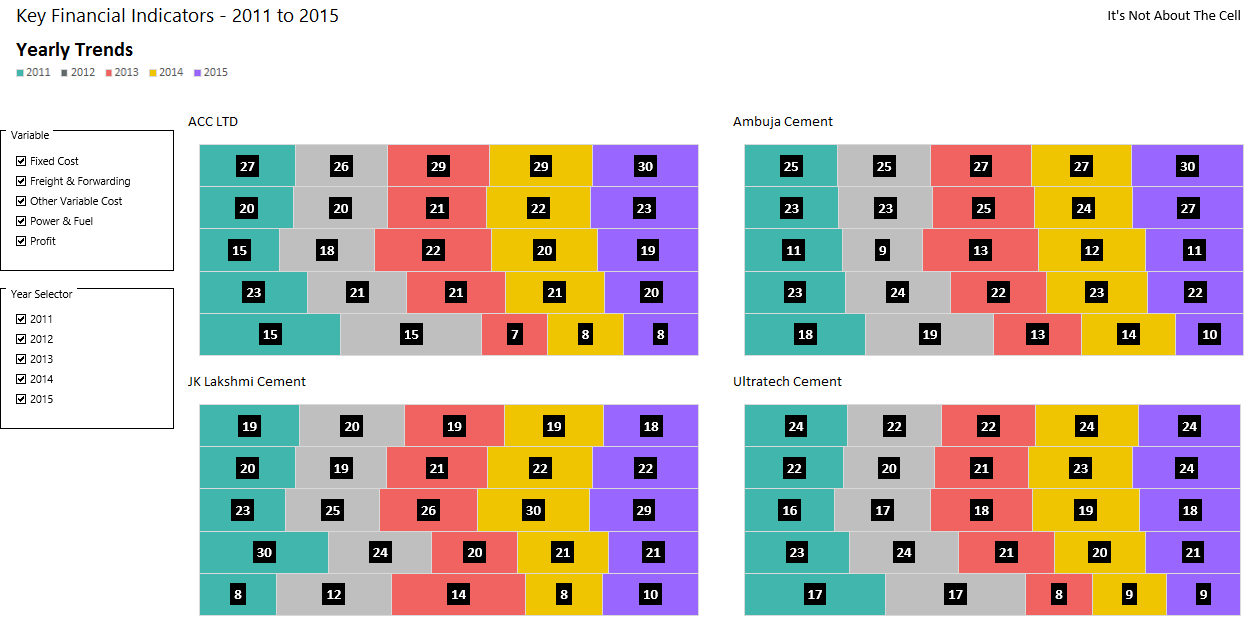
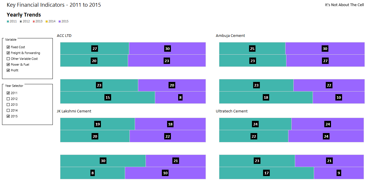
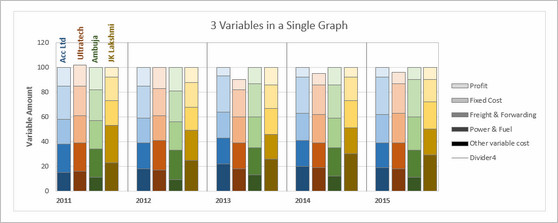
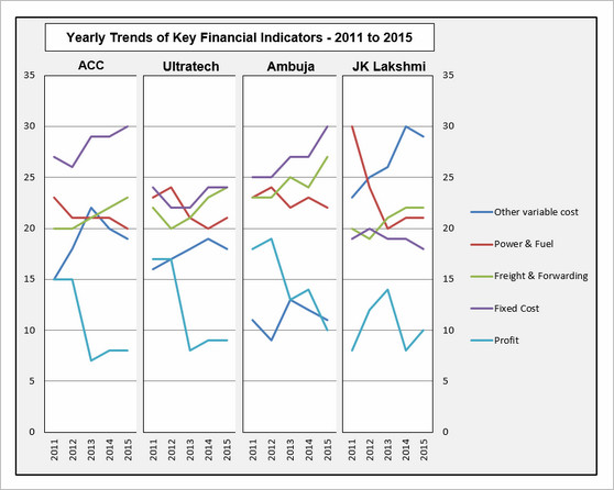
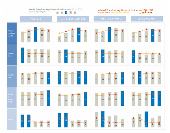
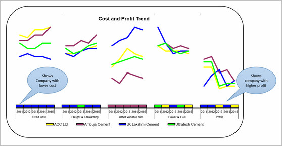
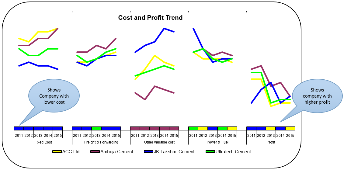
Chart by Marcel

- An interesting panel chart to analyze yearly trends and comparisons
- Somewhat hard to read, could have used left aligned bars.
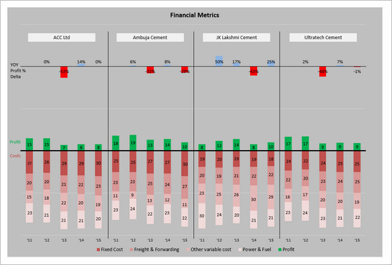
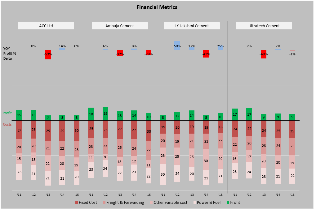
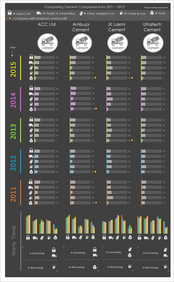
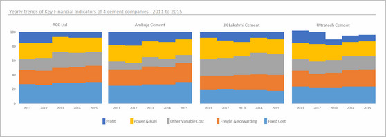
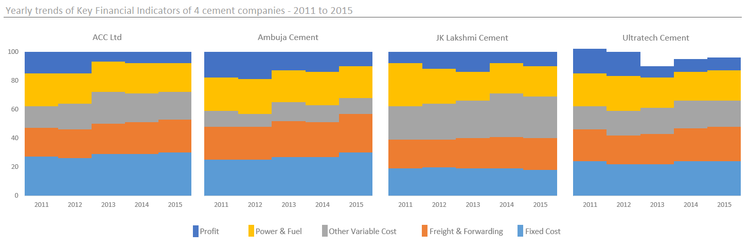
Chart by MF Wong
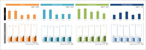
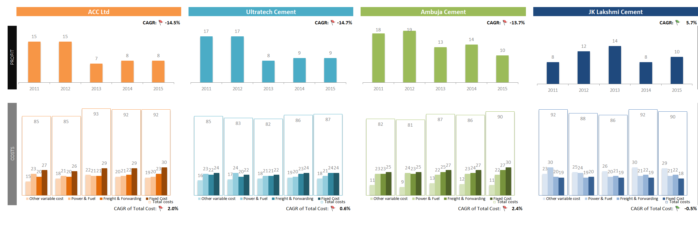
- Elegant panel chart with profit vs. costs view.
- Very interesting column chart (container chart?)
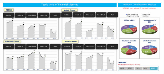
Interactive Chart by Michael
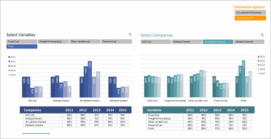
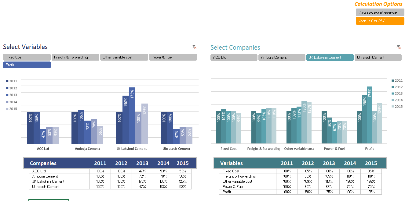

- Panel chart with YoY and company comparisons
- Slicers to mix and match values you want to analyze
- Could have used lines instead of columns, this way fewer colors can be used.
Chart by Miguel
- A panel / combination chart to see all trends in one place
- Could have used a form control to toggle between indexed vs. regular values. This will make the chart easier to read.
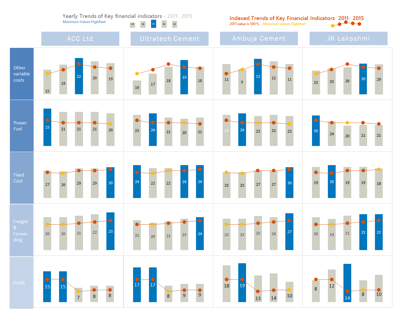
Interactive Chart by Nanna


- Dynamic dashboard with profit vs. costs view
- View by company or metric
- Time is shown on vertical axis. This makes comparisons / trend analysis hard.
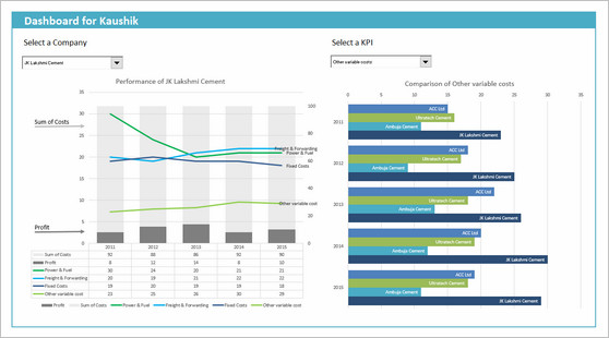
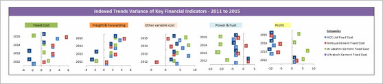
Chart by Pawel

- A simple and elegant indexed panel chart to view all trends in one place
- Nice colors and design. We can call it sperm chart

- Faint but visible vertical grid lines could make reading easier.
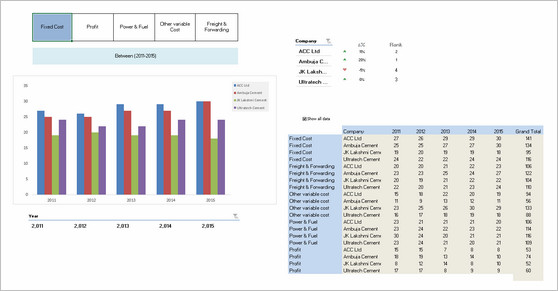
Interactive Chart by Peter

- A pivot chart with slicers to toggle measures and companies
- Could have added color legend and made the labels shorter
Become Awesome in Excel & VBA – Create dashboards like these…
- Learn how to create interactive dashboards & reports using Excel
- Develop your own macros & VBA code
- 50+ hours of video training
- Learn at your own pace
- Click here to know more
Infographic by Pinank

- Nice infographic style report in Excel.
- Interesting use of icons to represent costs
Interactive Chart by Ronny

- A pivot chart with slicers to pick measures
- Adding values across companies is not a good idea
Chart by Salim

- Charts made with Power View
- Can be filtered using PV filters
- Should have added views to see only one year value. Selecting year just highlights the values.
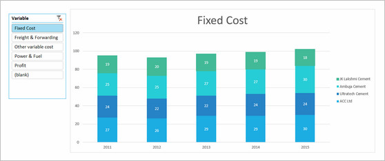
Chart by Shivraj
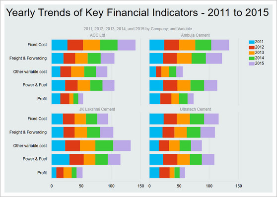
- An interesting panel chart with stacked columns to view yearly trends by all measures
- Simple colors and easy to read
- Since all the numbers add up 100 anyway, visualizing trends becomes hard. Should have used a slicer / form control to show one measure at a time.
Dashboard by Simayan
- A dashboard to understanding yearly trends
- Slicers to focus on any individual year.
- 3D pie charts are tricky to read. Should have used a stacked bar chart.
- Some of the labels are redundant.
Chart by Sudhir
- A simple line chart to understand yearly trends
- The tiles to show low cost / high profit companies is interesting.
- Could have used standard chart colors in Excel 2010. They offer better contrast.
Interactive Chart by Thomas


- A set of dynamic charts, each offering trends or comparisons based on user input.
- Lots of comparisons and variations possible
- Years on vertical axis can be tricky to read. Should have used another type of chart.

Interactive Chart by William

- A dynamic chart with lots of comparisons and analysis.
- Feels a bit buggy. The picture links are not updating on slicer selection.
Chart by Yuhanna


- Simple XY charts with yearly trends and variance analysis
- A bit harder to read as lots of dots overlap. Should have added an option to highlight one company at a time.
Become Awesome in Excel & VBA – Create dashboards like these…
- Learn how to create interactive dashboards & reports using Excel
- Develop your own macros & VBA code
- 50+ hours of video training
- Learn at your own pace
- Click here to know more
Techniques used in these dashboards & charts
If you want to create these kind of charts & reports at work, I suggest reading up the Excel Dashboards & Excel Dynamic Charts pages. Also check out below links to know more about specific techniques.
Form Controls Data validation Pivot tables Slicers Clickable Cells (VBA)
VBA Formulas Sortable Tables Data bars (CF)
Conditional Formatting Scrollable Tables Picture links Sparklines
Indexed Charts Panel Charts
How do you like these charts & dashboards? Which are your top 3?
Quite a few of these entries are really impressive. You can learn a lot by deciphering the techniques in these workbooks. Many thanks to everyone who participated. I will publish the winner names in next few days. Meanwhile, share your comments and tell me what you think. Share your top 3 entries too. 


