Over at Flowing Data, Nathan has published an interesting visualization about spread of obesity. Take a look at it here:
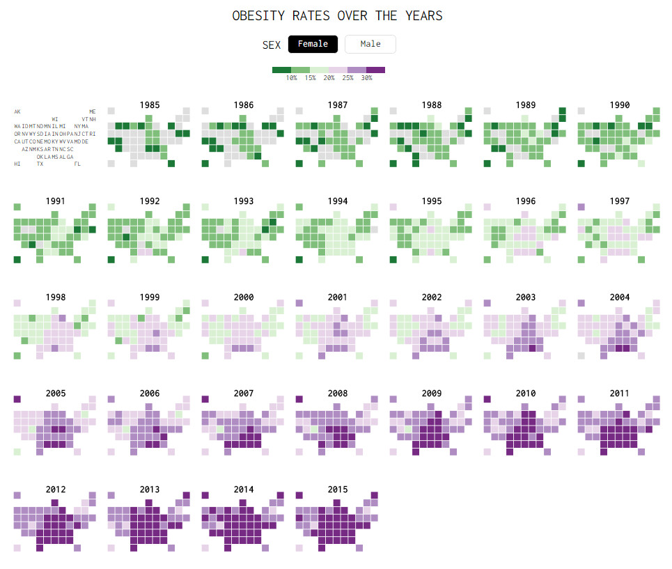
While the above chart is quite interesting, it doesn’t offer much insight in to the data. There are a few drawbacks,
- Understanding obesity trends for a given state over the years is hard due to the layout and format of the chart.
- Finding which states are experiencing most obesity growth rates is not possible
- Ironically, the chart itself is obese. It takes too much space to explain the data.
Nevertheless, the chart looks cool and can be reused with smaller data-sets (quarterly trends or just for a few years). So let’s recreate the same in Excel. While we are at it, let’s also build an alternative visualization to explore the obesity data.
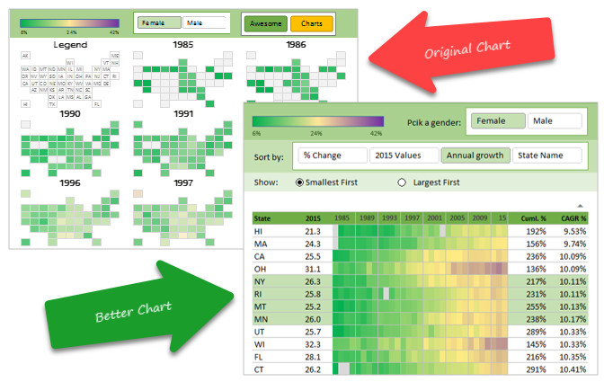
Spread of Obesity – Chart Critique, recreation and alternatives – Video
Please watch the below video to learn how to recreate the grid map in Excel. You can also see an alternative chart to analyze this data. You can also see this video on our YouTube Channel.
Download Spread of Obesity Interactive Excel Charts
Click here to download the spread of obesity Excel chart workbook. Play with slicers & form controls to analyze the data. Examine the formulas in Calc worksheets to learn how this is put together. If you are feeling particularly adventurous, try to make your own chart with the data. Share your charts in the comments section so we all can learn from you.
Related: Learn more about Maps in Excel – Monthly Master Class.
Do you like the grid map or alternative?
I like the alternative, it gives you many powerful ways to analyze the data and find interesting trends. What about you? Which one do you like? Please share your thoughts and suggestions for improvements in the comments section.
Some more charts for you play with…
If you like this chart, here are a few more you will love.
- What is your pay gap – Fish eye effect in Excel
- How Trump happened – Interactive Excel chart
- FIFA world cup goal timing analysis
- Closing gaps in gender equality chart
- More advanced charts & interactive charts


