Here is a simple but vital charting rule.
Start your bar (or column) charts from zero.
To illustrate why you should do this, let me share a personal example.
Over the weekend, the Jon Peltier visited Wellington. He is staying with Jeff (who occasionally guest blogs on Chandoo.org). On Sunday, we all decided to hike up a small mountain near my house for a leisurely family picnic.
While on the top of the mountain, Jo (my wife) took a few pics of us three Excel geeks. As we were standing on a sloping mountain face this is how the pictures look:

Looking at the picture on left, you would confidently say that I am way shorter than other two. But picture on right tells a different story.
Of course, the reality is somewhere between two pictures. It is difficult to conclude who is tall, who is short just looking at the pics simply because the baseline is sloping.
But we can’t have sloping baselines in Excel charts
You are right we can’t. But we can still confuse people with an arbitrary axis start. Like below:
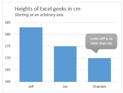
The fix? always start your axis at zero for bar (or column) charts:
Simple. Set the axis start point to zero (Select axis, press Ctrl+1, and from Axis options set minimum to 0).

So there you go. The shortest Excel charting tip ever, but still stands tall when it comes to telling great stories.
More charting principles:
If you are in the mood for some more charting theory and elegant methods, check out below links.
- Don’t make your charts heavier than they should be
- Give meaningful titles to your charts
- Use shapes to enhance your charts
- What is data to ink ratio and how to optimize it?
- More charting principles


