direct tag

CP055: “Yes, I am back” edition (and a bonus Excel tip)

Ladies & gentlemen, its time we revived the much loved Chandoo.org podcast. In the 55th episode, I do a lousy imitation of Arnold Schwarzenegger’s famous “I will be back” and tell you why there was such a long gap between episodes, my plans for reviving our podcast and more.

session-055What is in this session?

In this podcast,

  • Why there was such a long gap between last and this episode
  • What next?
  • How to extract every 6th item from a list?

Continue reading

direct tag

direct tag

Interactive Decision Tree Visualization in Excel [Trump vs. Hillary in Swing States]

It is election time in USA, and that means there is a whole lot of drama, discussions and of course data analysis. There are tons of cool visualizations published on all the data. Previously, we talked about “How Trump happened” chart.

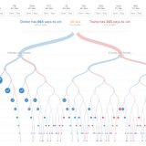
Today let’s take a look at the beautiful decision tree chart by NY Times explaining what would happen if each of the 10 swing states vote for Democrats or Republicans. Go ahead and look at that chart. And when you are done playing with it, come back.

My first thought after looking at the chart is: Wow, that is cool. I wonder how we can recreate that experience in Excel?

But as you can guess, making a dynamic tree visualization in Excel is pretty hard. You can create a bubble chart mixed with XY chart to show all the nodes of the decision tree, but as this tree has 2^10 nodes at the bottom level (and 2^11-1 total nodes) our chart would look very clumsy and busy.

So, instead of replicating NY Times chart, why not make our own version that explains the data? You can reuse this idea when visualizing outcomes of several what-if scenarios. Continue reading

direct tag

direct tag

Currency format Pivot fields with one click [Friday VBA]

Anyone who has made a pivot table and their grandma knows that formatting them is a pain. Let’s recap the steps to apply one of the most common formats – currency format.

  1. Right click on any value field
  2. Go to Value field settings
  3. Click on “Number Format” button
  4. Choose Currency format
  5. Close the boxes, one after another

Unless you get paid per click, you wont be happy with all those clicks.

Wouldn’t it be cool to just click once and apply most common format to your pivot fields?

Of course you can. Just add oneClickCurrency macro to your personal macros workbook. And then add this to your Home ribbon as a custom button and you have a one click format option for any pivot. Continue reading

direct tag

direct tag

direct tag

direct tag

A quick tip about data analysis while on bike [Video + Personal]

Wellington(NZ) sure is beautiful on a clear day. There are so many cool bike tracks, walking trails and beaches to keep you busy. Today, I went cycling on my usual route towards Makara beach. At the turn off point, I thought, “This is selfish. I can’t keep all this beauty to myself. I must share it with you.” So here we go.

A quick video about data analysis while on bike

Technically, I was not on bike when recording this video.  Watch it below or on our YouTube Channel. Continue reading

direct tag

direct tag

Check if a range has all numbers from 1 to n [Homework]

Finally, spring weather showed up in Wellington this week. We cashed it as much as possible by going on treks, cycling trips, more treks and of course doing laundry.

Anyways, I don’t have time to blog. I must go out and help kids with some cycling. But I want to keep you busy this weekend. So here is a fun homework problem.

Does my range have all numbers from 1 to n?

Let’s say you have a range called range (duh!).  And you want to check if range has all the numbers 1 to n (say n=5) in it, each number appearing only once (no more, no less). You can assume the named ranges range and in your formulas.

See above examples to understand the problem.

So go ahead and post your formulas in the comments section. I will sneak in whenever I can to look at all your creative answers. Continue reading

direct tag

direct tag

Mapping Spread of Obesity [Chart Critique and Alternatives]

Over at Flowing Data, Nathan has published an interesting visualization about spread of obesity.

While the above chart is quite interesting, it doesn’t offer much insight in to the data. There are a few drawbacks,

  • Understanding obesity trends for a given state over the years is hard due to the layout and format of the chart.
  • Finding which states are experiencing most obesity growth rates is not possible
  • Ironically, the chart itself is obese. It takes too much space to explain the data.

Nevertheless, the chart looks cool and can be reused with smaller data-sets (quarterly trends or just for a few years). So let’s recreate the same in Excel. While we are at it, let’s also build an alternative visualization to explore the obesity data. Continue reading

direct tag

direct tag

direct tag

direct tag

Visualizing target vs. actual progress – Biker on a hill chart

Over the years, we have discussed a whole heap of techniques to visualize budget vs. actual charts. Today let’s take a ride on this slope again and learn another fun, silly & awesome way to depict target vs. actual progress.

Introducing biker on a hill chart

Tada!!!

Biker on a hill!?! Don’t worry, I didn’t fall down on a descent and lose my brain. I am talking about an Excel chart to visualize target vs. actual progress on a time line with biker on a hill analogy. See the above chart, you will know.

Looks interesting? Read on to learn how to create this in Excel. Continue reading

direct tag

direct tag

direct tag