direct tag

The Whole Life Productivity Manifesto

It used to be that work was work, and everything else was life. But with the advent of mobile technology, work is now everywhere. Work and life are not separate. It’s about whole life. Productivity techniques no longer apply to just work. They have to apply to our whole lives if we are going to […]

The post The Whole Life Productivity Manifesto appeared first on Whole Life Productivity.

Continue reading

direct tag

direct tag

Weighted Sorting in Excel [video]

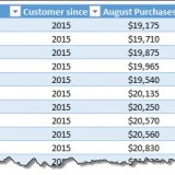
Imagine you are looking customer data like below and want to sort them by performance. If you sort the data by any one column, you will not get full picture of performance. To understand which customers rank low on performance, you need to defined a weighed sort, the kind of sort where you assign weights to each attribute (customer age, recent purchases and rate of returns) and come up with single score to sort them all.

Sounds interesting? Watch below video to understand how to do weighted sorting in Excel. Continue reading

direct tag

direct tag

Unpivot data quickly with Power Query [tutorial]

Power Query (Get & Transform data in Excel 2016) is a must have tool, if you wrangle with data every day. Here is a quick introduction, in case you are new.

Let’s learn how to use Power Query to unpivot data.

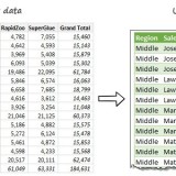
Essentially, we are trying to go from left to right in the above picture.

Doing something like this thru either formulas or VBA can be very complex. But Power Query can get you unpivoted data in just a few clicks. Sounds interesting? Read on. Continue reading

direct tag

direct tag

Opening A New Door

The end of SimpleProductivityBlog.com…and the start of something really great…Whole Life Productivity (http://wholelifeproductivity.com)
The post Opening A New Door appeared first on Simple Productivity Blog.

More great content can be found on the… Continue reading

direct tag

direct tag

CP045: Introduction to Monte Carlo Simulations in Excel

In the 45th session of Chandoo.org podcast, let’s get in to Monte Carlo simulations.

What is in this session?

In this podcast,

  • Quick personal updates – 200km BRM and book delay
  • History of Monte Carlo simulations
  • Monte Carlo simulations – an example
  • How to do simulations in Excel
    • Formulas
    • VBA
    • Data Tables
  • Using data tables to run simulations – case study – estimating Pi value
  • Things to keep in mind when setting up your simulation models
  • Resources on Monte Carlo simulations in Excel
  • Conclusions

Continue reading

direct tag

direct tag

How countries spend their money – chart alternatives

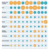
Econimist’s daily chart is a one of my daily data porn stops. They take interesting data sets and visualize in compelling ways. While the daily chart page is insightful, sometimes they make poor charting choices. For example, this recent chart visualizing how countries spend their money uses a variation of notorious bubble chart. Click on the chart to enlarge.

20150912_woc650_1

What is wrong with this chart?

Bubble charts force us to measure and compare areas of circles. Unless you have a measuring tape somehow embedded in your eyes and you are a walking human scientific calculator, you would find this task impossible.

So when you look at the chart and want to find out what percentage Japanese spend on restaurants or how much Americans pay for housing, your guesses will have large error margins.

Not only bubble charts are difficult to read, they are very hard to align. So when you have a bunch of bubbles, no matter how hard you try, your chart looks clumsy (see how the Russian food bubble eats in to Mexico’s bubble, as if it is too hungry 😉 )

Let’s check out a few alternatives to this chart. Read on… Continue reading

direct tag

direct tag

Relaunch-cation

I am on “vacation” this week in order to prepare for the major announcement coming next Monday. Check back then!
The post Relaunch-cation appeared first on Simple Productivity Blog.

More great content can be found on the site at Simple Productivity Bl… Continue reading

direct tag

direct tag

Show forecast values in a different color with this simple trick [charting]

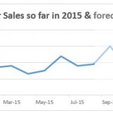
Let’s say you made a chart to show actual and forecast values. By default, both values look in same color. But we would like to separate forecast values by showing them in another color.

If you are a seasoned Excel user, you may be thinking, “Oh, that’s easy. I will just create 2 sets of data (one for actual and one for forecast), make a chart from them and apply separate colors.”

But here is a really simple way to get the same effect.

Use a semi-transparent box to mask the forecast values, as shown above. Read on to learn how to do this. Continue reading

direct tag

direct tag

Excel Links – Dashboards book delayed edition

Quick update about Dashboards for Excel book:

Dashboards for Excel - advanced Excel, analysis, reporting & automation book from Jordan Goldmeier and Purnachandra DuggiralaAs you may know, my first print book – Dashboards for Excel (co-authored with Jordan Goldmeier) is supposed to release today – 15th September, 2015. But unfortunately, there is some delay with the printing process, so the book is not available yet. Our publisher, Apress, tells us that it can take two more weeks.

Thanks to all of you who pre-ordered this book. I am sorry for this unexpected delay. Just few more weeks and you will be reading it. 🙂

Time for another round of Excel links Continue reading

direct tag

direct tag

Learning To Say No

I have a confession to make. I have a hard time saying no. I am constantly asked to do things…because I have done things in the past. Unfortunately, that doesn’t mean I have time in my schedule for the constant inflow of tasks. Yet the tasks still co… Continue reading

direct tag