We all know that area charts are great for understanding how a list of values have changed over time. Today, let’s learn how to create an area chart that shows different colors for upward & downward movements.
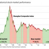
The inspiration for this came from a recent chart published in Wall Street Journal about Chinese stock markets.
We will try to create a similar chart using Excel. We are going to create the above chart in Excel.
Looks interesting? Read on… Continue reading