How would you analyze data when you have lots of it? That is the inspiration for this series.
A little background
We are re-opening enrollments in to the 50 ways to analyze data program in another week (on 24th of February, Wednesday). I want to share the process, techniques and visualizations you can use to analyze any business data with a case study. In this series of articles, let’s analyze fairly complex and large data set to derive insights.
Please join our Analytics Email Newsletter to get all three parts of this series and information about 50 Ways to Analyze Data program.
Let’s meet our data – Finance Industry Consumer Complaints
As part of open data initiatives, US government & Consumer Financial Protection Bureau maintain a list of all consumer complaints made against financial institutions (banks, credit unions etc.) You can download this data from the catalog page here. I have obtained the data on 1st of February, 2016. The download has 513,824 records. Each row contains one complaint.
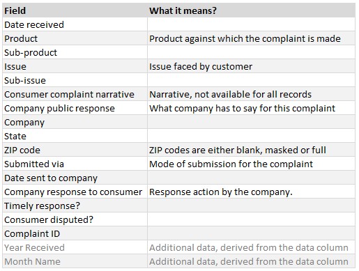
The data has these columns.
Analyzing with a blank slate – how to start?
Here is how we can find things to analyze / discover / visualize / present in similar situations.
Metrics & KPIs
All industries have metrics / KPIs. Can you identify the metrics that matter in a given situation? For example, if you are the CEO of Citi Bank and you want to understand your bank’s performance in the customer service area, you could define below metrics:
- Complaints per million transactions: A high rate indicates poor customer experience.
- Average response time: Low response times indicate smooth & well defined processes and empowered support staff.
- % of disputed resolutions: A high percentage indicates customers are not happy with the solution offered by the bank.
Top x items
Knowing which products / regions / customer groups are making most complaints (or most anything) can help you identify underlying issues and address them. Let’s say you found out that identity theft is a big issue, you could launch a campaign to educate customers about safe banking, offer additional security measures like 2 step verification etc.
Trends
You could look at the trend of complaints (or any other metrics) over time to understand improvement in the performance. Let’s say you want to understand how your safe banking campaign impacted number of complaints made in the identity theft category. A trend analysis will provide the information you want.
Pareto Analysis
This is a variation of top x items. If you are short on resources and want to know which items are easy pickings to improve your customer service. A Pareto analysis on the issues raised by customers can tell you just that.
Distribution
Knowing how things are spread on an axis can help you optimize your processes. For example, if you know that every Wednesday we get a lot of complaints, we can plan our contact center staffing in a such a way to reduce the average waiting time.
Many more…
A blank canvas (in this case, raw data) offers many possibilities. As an analyst, our job is to dig out the information that helps our company succeed.
Ways to analyze this complaint data
As there are many options, I just picked three to showcase what we can do. Feel free to download the data and do your own analysis.
- What do they complain about – Part 1
- Regional trends – Part 2
- My bank vs. your bank in a scorecard – Part 3
What do they complain about?
There are 11 types of products & 48 sub-products spread across 3,496 companies. There are 95 types of issues faced by customers, further categorized in to 68 sub issues. And there is complaint narrative (only available on 50,902 complaints or roughly 10%).
Making sense of all this text can be hard and complex.
This is where pruning comes in to picture. If we can understand just top 25 issues and give user the power to drill down to any product / state / time frame, then users can discover issues that matter most.
Analyzing top 25 issues
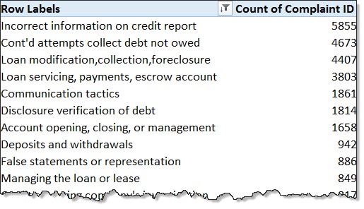
The first step is simple. We just make a pivot table from the data (make sure you add the pivot table to data model to capitalize on new Excel features) and drop the issue in rows area and complaint ID in to values area.
We get this:
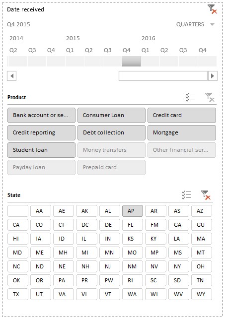
Now, add below filters
- Timeline on the Date Received
- Slicer on Product
- Slicer on State
Sort the pivot table by descending order of Complaint Count.
Although the sorted pivot table (first 25 rows) provides the answer we want, it is a tough nut to chew. So let’s jazz it up.
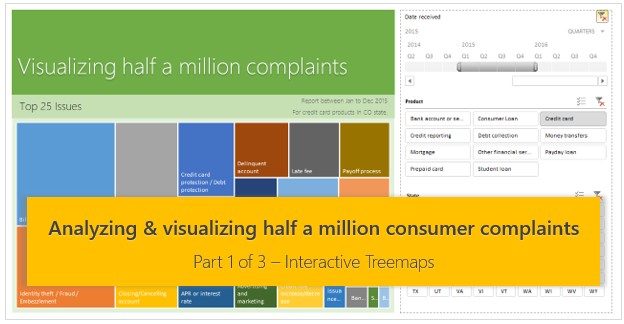
Visualizing top issues – Treemap
For the visualization, let’s use Tree map chart introduced in Excel 2016. If you are using Excel 2013 or earlier, don’t worry. We will learn another way to visualize the data further down this page.
If you select the pivot data and try to insert a treemap chart, you get a message booing you.
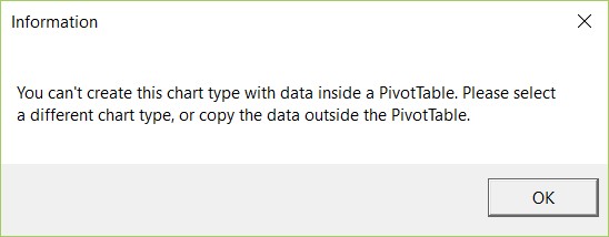
No worries, we will trick Treemap to work with pivot data. Just copy the first 25 rows of the pivot and paste them as link in a blank sheet.
Now that the data is in a regular Excel range, we can create a Treemap from it. Before we do that, let’s just add 26th row to the data, with the issue label [Other], which is the total of any issues outside top 25.
Select all this data and insert a treemap from Insert ribbon.
Polishing the visualization
Let’s move the chart, slicers & timeline to a separate sheet. Just cut and paste them.
Polish the slicers using styles and customization features (disabling the header, adjusting number of columns etc.) For more on slicer customization, read Introduction to slicers.
Adjust timeline granularity to Quarters.
Our polished slicers
Set up descriptive chart title & captions by harvesting the data from slicers, timeline & pivot. You may refer to download workbook for the actual formulas. Note, these work only in Excel 2013 or above.
The final visualization looks like this, click on it to enlarge.

Demo of the visualization
Check out the video demo of this interactive visualization & analysis.
Alternative Visualization for Excel 2010
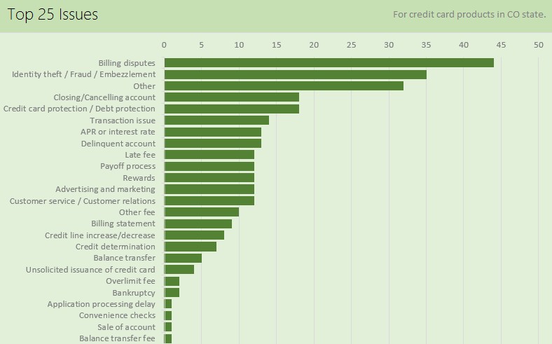
As Treemap is not available in Excel 2013 or earlier, we can use other visualizations like bar charts or conditional formatting heatmaps to visualize this data. Here is an attempt, using bar charts. Click to enlarge the image.
Download Example Workbook
Please click here to download the consumer complaints analysis – part 1 workbook. Play with the visualizations to learn more.
Note: this file is 100 + mb. So give it a few minutes to download.
How would you analyze the complaint data?
Go ahead and play with this data yourself. How would you analyze it? Please share your ideas, analysis & charts in the comments section. If you wish to publish a chart, email it to [email protected] with the subject “Half a million complaints”. I will add your chart at the end of this post.
Sign up to receive remaining two parts & more…
If you like this and want to learn more about data analytics, understand how our 50 ways to analyze data program can help you, sign up for our course newsletter. Please click here.


