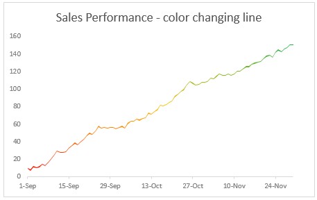
Let’s learn how to create a color changing line chart using Excel. This is what we will create.
Looks interesting? Read on.
Why color changing line charts?
I will be honest. These charts offer no new information. The height of line already encodes the information we need. Color is merely an eye candy. But sometimes you may want some eye candy. If so, you can use this tutorial.
Let’s look at the data:
Let’s say we have some data for 3 months starting 1-SEP-2015 in a table like below. We need to add 3 extra columns – Before, Line & After as shown in the below picture.

What are these 3 columns?
- Before: This is value – 1
- Line: this is simply 1
- After: We first calculate the maximum possible value (let’s say 160) and then subtract value from it. ie 160-value.
Create a stacked area chart from Before, Line & After data:
Select all three columns (before, line & after) and create a stacked area chart.
This is what we get:

Fill plot area with red yellow green gradient
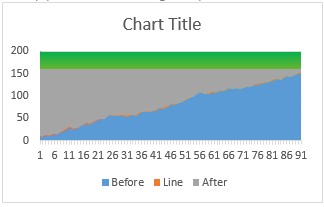
- Select plot area of the chart and fill it with a Red-Yellow-Green gradient (see below)

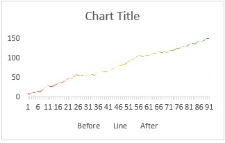
Fill colors in before, line & after series
- Select before series and fill white color
- Select after series and fill white color
- Select line series and fill it with no color (ie make it transparent)
This is what we get:

Adjust vertical axis maximum
to 160 (or any other value as used in your calculations earlier)
At this stage, our chart looks like this:
Clean up and format the chart:
- Adjust horizontal axis labels
- Set up a chart title
- Remove legend
Now, our color changing line chart is ready:
Download color changing line chart workbook:
Click here to download the workbook. Play with the chart settings & data to understand this chart better.
Would you use such a chart?
I find very few uses for this chart. Also, when creating this chart using area chart technique, we loose the ability to add grid lines (as they are covered by the white color filled areas).
What about you? Would you use color changing line charts? Please share your thoughts and suggestions in the comments section.
Few more ways to spruce up your line charts:
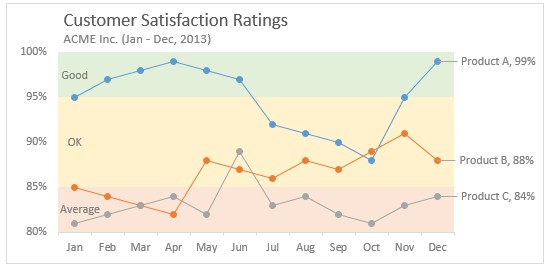
- Line charts with bands to tell how good or bad a value is.
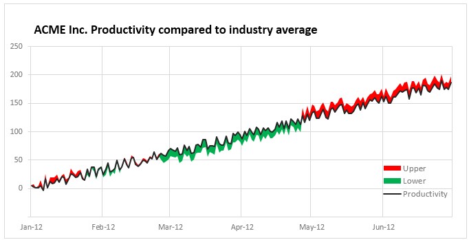
- Shaded line charts to compare with another metric
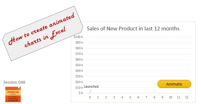
- Animated line charts in Excel