Here is a trap that is easy to fall in to. Confusing correlation as causation. As analysts, it is our job to see the data as it is rather than imply causation that doesn’t exist.
Let’s sample a chart, recently featured in Economist’s graphic detail under the title Measuring well-being.
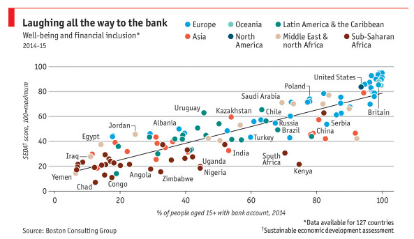
At the end of the article they show the above chart and say, (emphasis mine)
BCG also compared financial inclusion (the percentage of individuals aged 15 or over with a bank account) against each country’s SEDA score, revealing a clear relationship.The report’s authors found that countries with higher financial inclusion generally had higher well-being than their peers at a similar income level.
Now, it is easy to misunderstand above chart and come to a conclusion that if you provide bank accounts to everyone in a country, then the country’s SEDA score (well-being) would improve.
But this would be wrong.
As an analyst leaning towards awesomeness, you want to ask questions like,
- Is it a coincidence that countries with higher well-being naturally have bank accounts for everyone?
- How does having a bank account impact a person’s well being?
- What other factors can contribute to well being? What about access to education, healthcare and information?
So there you go. Next time you see data or visual analysis that exhibits correlations, do not confuse them as causation. Question the factors first.
More charting principles and guidelines for you
- How to select right chart for your data
- Don’t make your charts heavier than they should be
- Avoid data dumps in your charts
- Understand data to ink ratio to make better charts
Do you often confuse correlation with causation?
Have you seen such misinterpretation of data in your work life? What was it like? Please share your thoughts in the comments section.


