In the 38th session of Chandoo.org podcast, Let’s optimize data to ink ratio of your charts.
What is in this session?
In this podcast,
- Announcements
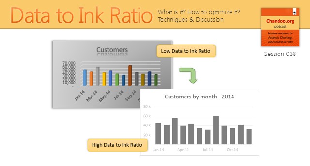
- What is Data to Ink Ratio?
- Obvious ways to optimize Data to Ink Ratio
- More ways to optimize Data to Ink ratio
- Highlighting what is important
- Conclusions
Listen to this session
Click here to download the MP3 file.
Links & Resources mentioned in this podcast
Recommended Books for creating better charts:
- Information Dashboard Design by Stephen Few
- Visual Display of Quantitative Information by Edward Tufte
Optimizing data to ink ratio – Charting case studies
- Closing gaps in gender equality chart
- Why 3D pie charts are evil…
- Visualizing world education rankings
Techniques for highlighting what is important
- Display alerts in dashboards to grab user attention
- Adding meaning titles & legends to charts
- Never show simple numbers in your dashboards
Invitation to “Becoming a better analyst” Webinar
As mentioned in the podcast, I am running my first ever webinar on Wednesday, July 15th – 2015 (2PM EST). The topic is “How to become a BETTER analyst?”
Please click here to register for the webinar & become a better analyst.
Transcript of this session:
Stay tuned for a full transcript of this podcast.
How do you optimize Data to Ink Ratio?
What about you? Do you worry about data to ink ratio when making charts? How do you optimize it? Do you have a process for it? Please share your tips by posting a comment.
Subscribe to Chandoo.org Podcast