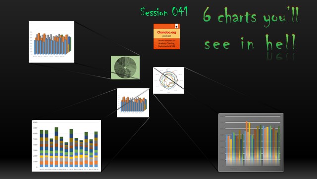
In the 41st session of Chandoo.org podcast, Let’s take a trip to data hell and meet 6 ugly, clumsy, confusing charts. I am revisiting a classic Chandoo.org article – 6 Charts you will see in hell.
What is in this session?
In this podcast,
- Quick announcement about Awesome August
- 6 charts you should avoid
- 3D charts
- Pie / donut charts with too many slices
- Too much data
- Over formatting
- Complex charts
- Charts that don’t tell a story
- Conclusions
Listen to this session
Click here to download the MP3 file.
Learn more about which charts to avoid, which ones to make
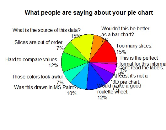
On Pie charts:
Here is an ugly, clumsy pie chart to prove the point. [ Source: Bill the Lizard ]
- Should you use pie charts? – podcast session 004
- Why 3D pie charts are evil
On making charts when you have too much data:
- Panel charts (or small multiples) in Excel
- Panel Chart case study – Survey results visualized
- Sparklines
On formatting:
- Avoid Gangnam styles
- Impressing your boss with Excel charts – 6 step road map for you – podcast session 029
Transcript of this session:
A full transcript of this podcast will be uploaded soon. Stay tuned.
Do you create any of these charts? Share your story
As a fresh analyst, I created all of these 6 charts. But I quickly realized that each time I made a 3D pie chart, I am selling a small piece of my soul to the devil. So I atoned my sins by scattering everywhere and visiting lots of bars. 
What about you? Have you ever created any of these charts? What did your users say when they saw these charts? Share your story in the comments.
Note: This is a part of Awesome August Excel festival.


