Recently, I had to make a bunch of panel charts. After wrangling with Excel (and a tiny bit of VBA) to create them, I wondered if we are suffering needlessly by being too loyal to Excel. I switched to R and could create these panel charts in almost no time (well, first I had to learn how to pivot the data using dplyr). Today, let me share the experience.
The scenario – Visualize employee performance ratings
Around July, most companies in NZ have their employee performance reviews (or rem reviews). In August, all this review data is, well, reviewed so managers can decide whether any moderation (curve fitting) is needed and how much hike to offer. To help with this process, you need to first understand what proportion of staff are in each rating category. If you are head of a large company, then naturally, you want to know how this spread looks like at overall level as well as individual business group, branch levels, ie at various hierarchies.
The solution – Panel Charts
One quick and easy way to do this is by making lots of charts.
Enter Panel Charts.
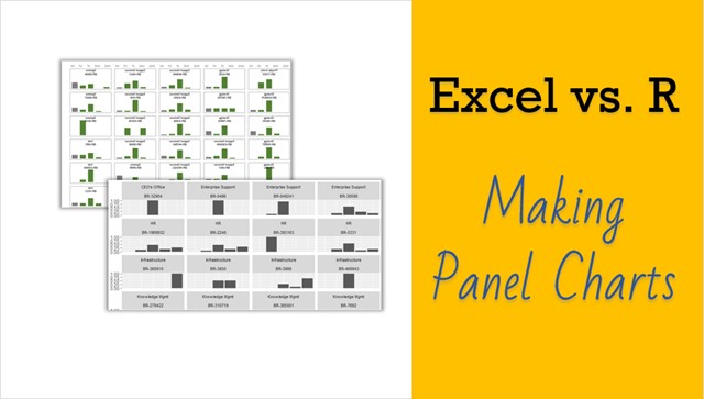
Let’s say you have 80 branches, spread across 10 business groups. Each branch has different number of people. To understand if the ratings are normally spread in a branch, you can make a column chart showing number of people in each rating category. Then to see how this spread looks across the company, simply create 80 charts, one per branch.
Related: Introduction to Excel Panel Charts.
80 Charts – that is not fun!!!
Tell me about it. You might need a strong cup of espresso and right mood for lots of copy pasting.
Or you could use some VBA to do the dirty work for you.
In either case, you are going to waste (and hate) that afternoon.
An alternative – use Sparklines
If you are not in the mood for manic copy pasting, then you could use sparklines to cheat. Once you make 80 sparklines, you can just move them around so they look like an 8×10 grid.
It is still a lot of work, but less annoying than creating 80 charts.
A better solution – use R
If you are familiar with programming (VBA/C or something else) you can quickly learn the basics of R and use simple code to convert raw data to elegant panel chart in almost no time.
OK, show me how.
Watch below video. I explain both Excel sparkline and R approaches. As the process is elaborate (especially the Excel one), I am using video format. See it below or on Chandoo.org channel.
Download the resources – Excel file, R code and CSV
Use below links to download files:
- R code panel-gen.r
- Excel workbook with sparkline panel charts – panel-charts
- Raw data in CSV format – rem-data
Have you used R yet?
R is fun, interesting and challenging. If you have some free time, pick it up. It is free and offers heaps of possibilities for statistical analysis, data science, modeling, visualization, data cleanup and exploration. If you are looking for a book, I suggest R for Data Science by Hadley Wickham and Garret Grolemund.
If you are doing some R programming, please share your experiences and thoughts in comments.


