A few days back, WSJ ran a visualization titled “What’s your pay gap?” It depicts median pay gap between female & male workers in 422 different professions in USA. The chart uses fish eye effect to highlight the selected profession. See below demo to understand the effect.
Discussion: Is the Fish Eye Effect worth it?
In this context, fish eye effect is useless. As we have too much data, the fish eye effect becomes mere eye candy and draws attention away from important matters at hand.
That said, it is a cool idea to use with smaller data sets.
Implementation: Fish Eye Effect in Excel
Out of curiosity, I wanted to implement the fish eye effect in Excel. We can highlight selected dots using simple algebra. To stretch the chart elements to left & right requires VBA. Since VBA creates portability issues, let’s focus on the algebra based fish eye effect.
Here is a quick demo of the final outcome.
Assuming you have a bunch of X & Y values (Profession & Salary in this case), to generate the new X&Y values with fish eye effect for a particular X value (say X1),
- Define gap as an integer value, indicating the gap to either side of highlighted value at X1. For the above example, Gap = 10.
- Calculate scaling factor for the left side of Fish Eye as (X1-gap)/X1
- Scaling factor for right side of Fish Eye as (Max X – X1 – gap)/(Max X – X1)
- Use these scaling factors to calculate new X values for all dots.
- Create a scatter plot with these new X values and Y values.
- Apply special formatting to X1 & Y1 values thru another series.
- Set up a form control or VBA to change X1.
- Your interactive fish eye chart is ready.
Alternative: Closing the gaps in Pay Gap Fish Eye chart
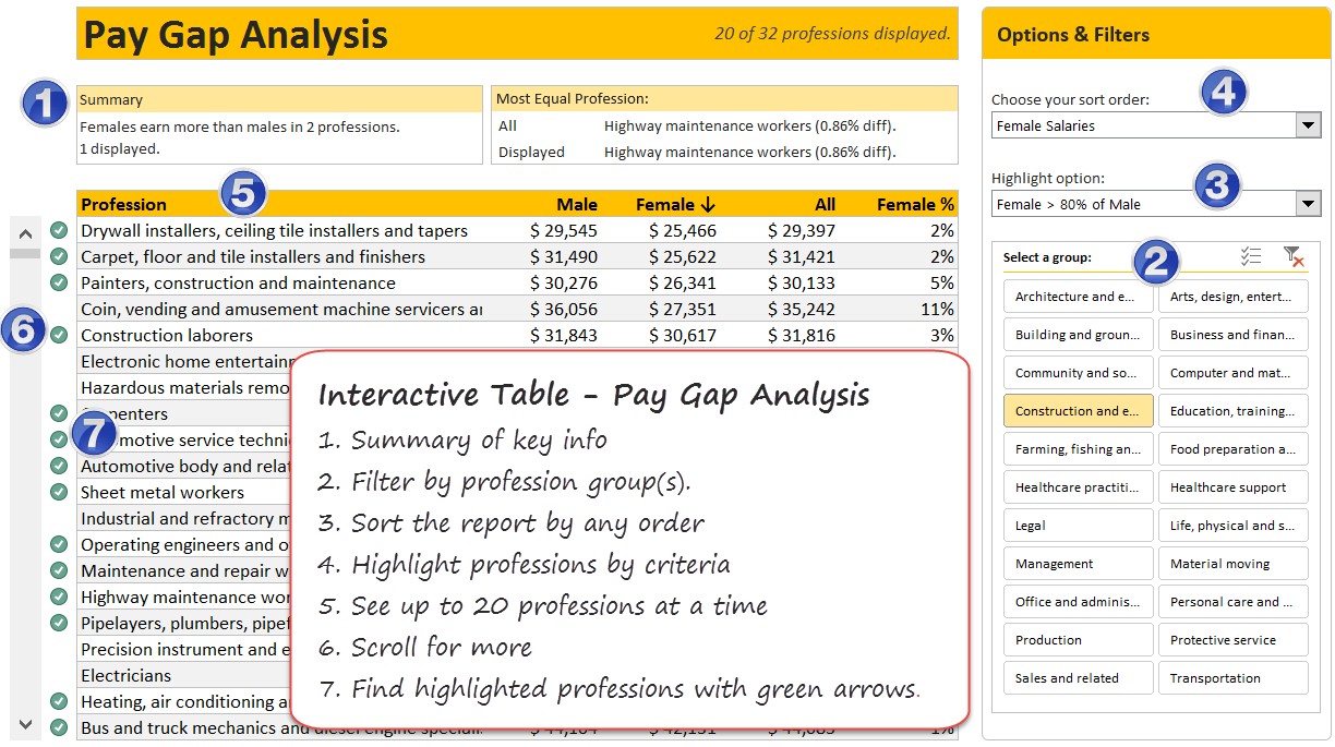
Okay, as you can see both original and Excel implementation of Fish Eye charts are mediocre. So let’s improve them. For this type of data, we can use interactive tables so that users can filter, sort and highlight the data any way they want. This allows for flexible exploration of data.
Here is a quick demo of the interactive table style visualization of Pay Gap data.
Interactive Pay Gap Analysis Table – Construction summary
- Construct 5 pivot tables, one for each sort order.
- Create a slicer on Profession Category and link it to all 5 pivots.
- Set up a form control to figure out sort order (and dynamically fetch one of the 5 pivot table data sets, using CHOOSE formula)
- Fetch 20 rows of selected pivot table data (use scroll bar position to determine which 20 rows)
- Apply conditional formatting to the 20 rows based on criteria specified.
- Calculate summary information and display it at the top.
Here are the key ideas used during construction of this:
- Scrollable KPI Dashboard – for scrollable list.
- CHOOSE formula – for creating dynamic named range
- Conditional Formatting – for highlighting professions
- Slicers for filtering a profession
- Form controls for sorting & highlight option selection
Video: Fish Eye vs. Interactive Table – Walkthru
Here is a quick video walk thru of both approaches along with some commentary and explanation.
You can watch the video on our YouTube Channel too.
Download the workbook
Click here to download the Fish Eye effect workbook. It contains both fish eye and interactive table visualizations. Examine the calculations tab for all the formulas.
How would you visualize this data?
Do you like the Fish Eye effect chart? How would you visualize this data? Please share your thoughts and implementations in the comments.
More case studies
Check out below tutorials and case studies to learn how to visualize complex data in Excel.


