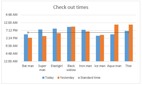
Let’s say you work in super hero factory as floor manager. You are looking at the recent time sheet data submitted by your underlings and want to know who works more. So you did what any self respecting floor manager does. You made yourself a large cup of hot chocolate, whipped open Excel and created a column chart.
But now, you want to add a line to it at 6:00 PM (or some other arbitrary point) so you can clearly see which superheros are over working.
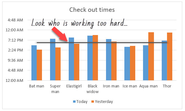
So how do you go about it?
Adding a line to column charts – Tutorial
This tutorial assumes you have a column chart. If you have a bar chart, you should use vertical error bars in step 6.
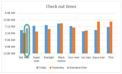
- In a cell, enter the value for your line. Say this is in C15 (and it has 6:00 PM)
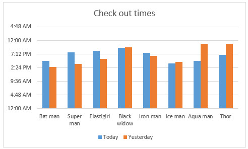
- Add this extra point to your chart. At this stage you will get this.
- Take a sip of that scrumpdillycious hot chocolate.
- Convert the new series to as XY chart. Just right click on it and select “Change series chart type”.
- Add error bars to this new dot
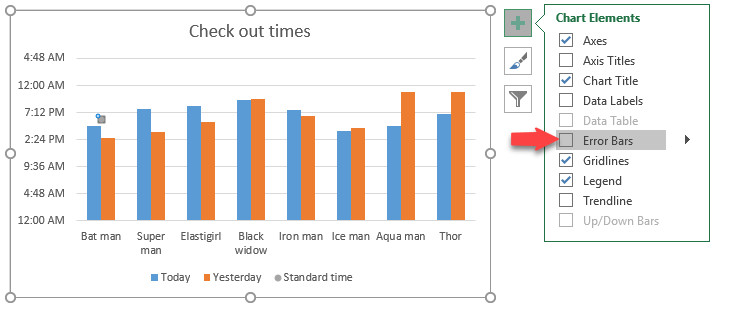
- Excel adds both vertical & horizontal bars. We just need horizontal line. So remove vertical (Y) error bars.
Note: if you are adding the line to bar chart, remove X error bars instead. - Set error bar value to 7 (same as number of categories – 1)
- Format the error bar
- Set error bar to plus side only
- Remove cap
- Set the line color and thickness
- Remove marker symbol (set it to no marker) so we have only line
- Chug the rest of your hot chocolate, we are done!
Video tutorial – How to add a line to column chart
Watch this quick video tutorial on how to add a line to column chart to understand this process better.
You can also watch this video on Chandoo.org Youtube channel.
Download Example Workbook – Column chart with a line
Please click here to download example workbook. Play with the input data to see the chart change. Try to recreate the chart from scratch to master this technique.
Become a super hero of Excel charting
Unleash the super hero in you by learning few charting tricks and tips. Start with below, but be warned though. Everyone is going to love your charts.
- Tell all versions of truth in your dashboards
- Color changing line chart…
- Cropped chart – when some values are too big for it
- Use shapes to enhance your charts
- 15 quick & powerful ways to analyze business data
How would you add a line to column charts?
Using error bars to add a horizontal line (or vertical) is just one of the many ways to do this. How would you add a line to column charts? Please share your techniques in the comments section.


