Kaushik, one of our forum members has an interesting problem.
Need to quickly visualize 3 variables ( Company, years, Financials) in a single […] chart.
Multiple variables over several years – How to chart?
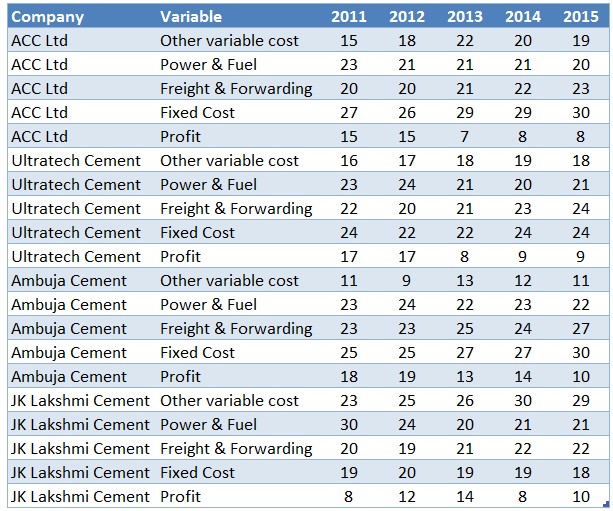
Let’s take a look at the data first.
Ways to visualize such data…
Whenever you want to visualize business data, the first thing to ask is,
- What is the purpose of this visualization?
Related: How to create right chart from your data?
Since we don’t know why Kaushik wanted to visualize all 100 numbers in a single chart, let’s define some goals for the chart.
- Yearly trends of financial metrics
- How one company compares with another over years
- How individual metrics contribute to overall revenue (all the 5 metrics add up to 100)
- What are the most interesting numbers, drastic changes or alarming trends
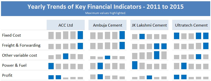
One way to answer these questions is thru a panel chart. It shows massive data in a concise chart and allows for exploration of inter-relationships.
See below.
Absolute trends:
Made with sparklines.
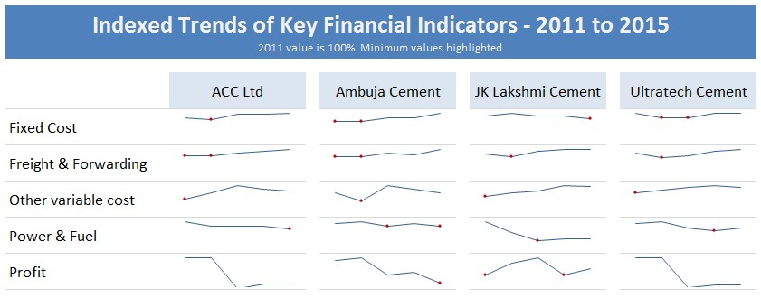
Indexed Trends:
And of course you can use indexed charts technique to explore the numbers better.
Your challenge – How would you visualize this data?
So here is something fun for you. Visualize this multiple variable data and share your charts.
What’s in it for you?
This is a contest. The two most awesome charts will $100 Amazon Gift Cards.
How to submit your entries:
- Simple. Download the data workbook.
- Create your chart in a new tab.
- Email your files to [email protected] with the subject “Multiple variable challenge”
- Send in your entries before July 4th, 2016 (Monday).
- We will showcase all the entries and pick winners by July 11th.
Fine print:
- You may submit multiple entries, but you can maximum of one gift card.
- No VBA based solutions. Excel or Power BI charts are ok.
- If you cannot accept Amazon gift card (because of where you live), you can opt for $100 cash thru PayPal.
Get busy charting…


