We all know that area charts are great for understanding how a list of values have changed over time. Today, let’s learn how to create an area chart that shows different colors for upward & downward movements.
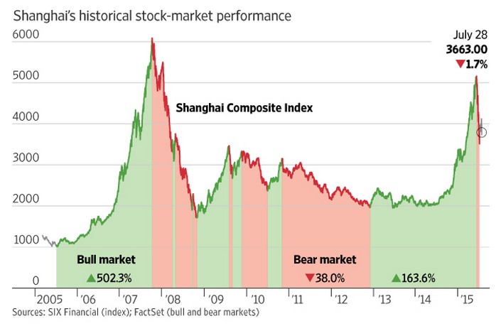
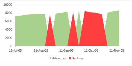
The inspiration for this came from a recent chart published in Wall Street Journal about Chinese stock markets (shown below).
We will try to create a similar chart using Excel.
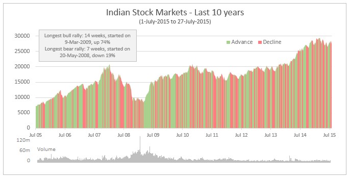
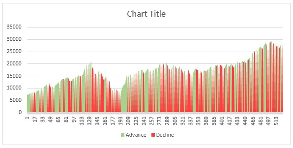
This is what we are going to come up with.
Looks interesting? Read on…
Creating an area chart with different colors for up & down slopes
Step 1. Gather the data
For our example, let’s use Indian stock market data for last 10 years. Specifically, BSE Sensex weekly closing prices between 1-July-2005 and 27-July-2015.
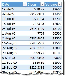
There are 3 columns in this data – Date, Closing price & Volume, as shown below. Let’s say all of this data is in a tabled named data that starts at cell B6.
Step 2. Find out when to switch colors
The next step is to find out when to switch colors.
We can add 3 additional columns to our data to spot the switches, and split data to Advances & Declines accordingly.
Here is what we get.
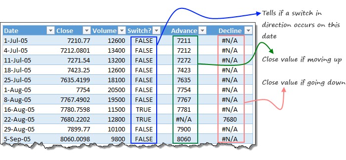
Detecting when a switch occurs:
When looking at closing price for a day, we need to know if the line direction has changed or not. To detect this, we can use a formula like this:
Assuming the closing price we are looking at is in cell C7,
=C7<>MEDIAN(C6:C8) will tell us if the value in C7 is switching the trend or not.
Why does this formula work? Think again. For more on this technique, refer to BETWEEN Formula in Excel.
Step 3. Expanding the data so that we can create an area chart
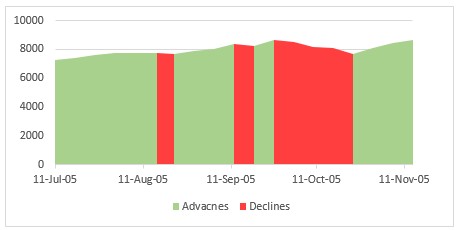
If we create an area chart with just the data from above step (only advances & declines columns), we end up with a chart that looks like this.
As you can see, the green & red areas (advancing & declining data) have tiny white space between them.
This is because, when we switch from green to red, the green series goes from peak to 0 and simultaneously, red series goes from 0 to peak, creating an effect like below (chart made from sub-set of data)
To create correct shading effect, we need to expand the data so that on dates when switching happens, there is a duplicate row.
See below illustration to understand what we need.
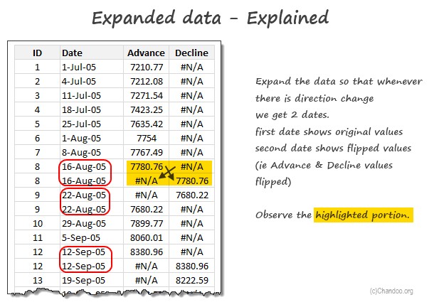
Writing formulas to expand data
We can use simple arithmetic along with healthy dose of INDEX formulas to create expanded data set. Can you figure out the formulas yourself as homework?
Please examine the downloadable workbook to understand these formulas more.
After expanding the data, the same area chart looks like this:
Step 4. Create area chart from expanded dataset
Select the expanded advances & declines columns and create an area chart from them. Make sure horizontal axis labels are pointing to the expanded date column we constructed in step 3.
Your chart is ready now.
We can add few more bells and whistles to it and come up with below output.
- The volume chart at the bottom is a sparkline
- We can find longest bull & bear rallies using longest winning streak formula
Download Area Chart with different colors for up & down slopes workbook
Please click here to download area chart with different colors workbook. Play with the chart & formulas to learn more.
How do you like area chart with different shades?
I think this is a powerful technique to quickly eye-ball data and see where directional changes are occurring, what patterns (if any) are they following etc.
If you observe carefully, our Excel version and WSJ’s charts differ in one key aspect. In WSJ chart, they are shading bull & bear markets where overall trend is upwards or downwards with minor changes during the market period. What formula / approach changes do you think are necessary to make exact replica of WSJ chart in Excel?
Also, do share your feedback about this chart and how you are planning to reuse the concepts at your work.
Charts to show change over time
Understanding change is a key component of any analysis. Check out below charting techniques & tutorials to learn few more valuable skills.
- Narrating the story of change – Case study on how fast America changes its mind
- Advances vs. Declines chart
- How tax burden has changed over years – interactive Excel chart
- Use indexed charts when analyzing change over time
- Never show simple numbers in your dashboards
- Comparing with benchmarks – shading under / over achievement


