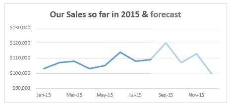
Let’s say you made a chart to show actual and forecast values. By default, both values look in same color. But we would like to separate forecast values by showing them in another color.
If you are a seasoned Excel user, you may be thinking, “Oh, that’s easy. I will just create 2 sets of data (one for actual and one for forecast), make a chart from them and apply separate colors.”
But here is a really simple way to get the same effect.
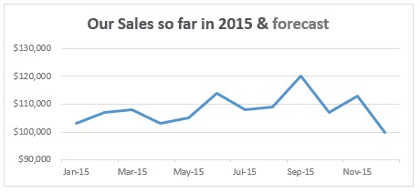
Use a semi-transparent box to mask the forecast values. The end result is shown below.
Here is how the trick works:
- Create the chart from all values.
- Draw a rectangle (box) shape on your spreadsheet.
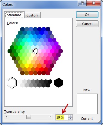
- Fill it with white color and remove outline (set the outline color to no line).
- Select the box, Go to Fill > more colors and set it to 50% transparent.
- Place the box on top of chart, adjust its size and position to overlap the forecast data.
- Your forecast looks in a different color!
See below demo to understand the process:
Learn more about forecasting
If your work involves trend analysis & forecasting, check out below resources:
- Introduction to trend analysis in Excel – podcast
- Doing trend analysis & forecasting in Excel – 3 part series
- How to highlight best months & weeks in charts
How do you highlight your forecasts?
My personal favorite is to use dotted lines to separate forecasts. This involves either using Excel’s chart trendline option or adding a dummy series thru formulas to show the forecast line. When I am in a hurry, I usually add a semi-transparent mask to set aside the forecast values.
What about you? How do you highlight forecast values in your charts? Please post your technique in the comments area.


