On twitter I follow many charting and visualization related accounts. One of them is @Andy Kriebel, who runs Makeover Monday. The idea is simple. Every Monday they publish a data-set and ask the community to visualize. Last Monday (6th May, 2018), they have published about toughest sport by skill data. This categorizes 60 sports by 10 skill categories to find out which sport is the toughest. Over the weekend, Andy posted a summary of all toughest sport viz entries. Many of the entries are made in Tableau. I thought it would be a fun challenge to re-create some of these charts in Excel. The result is this post. 60 sports in 6 charts. Check out the charts and download workbook to learn more.
First four charts are re-creations of Tableau designs. Last two are mine.
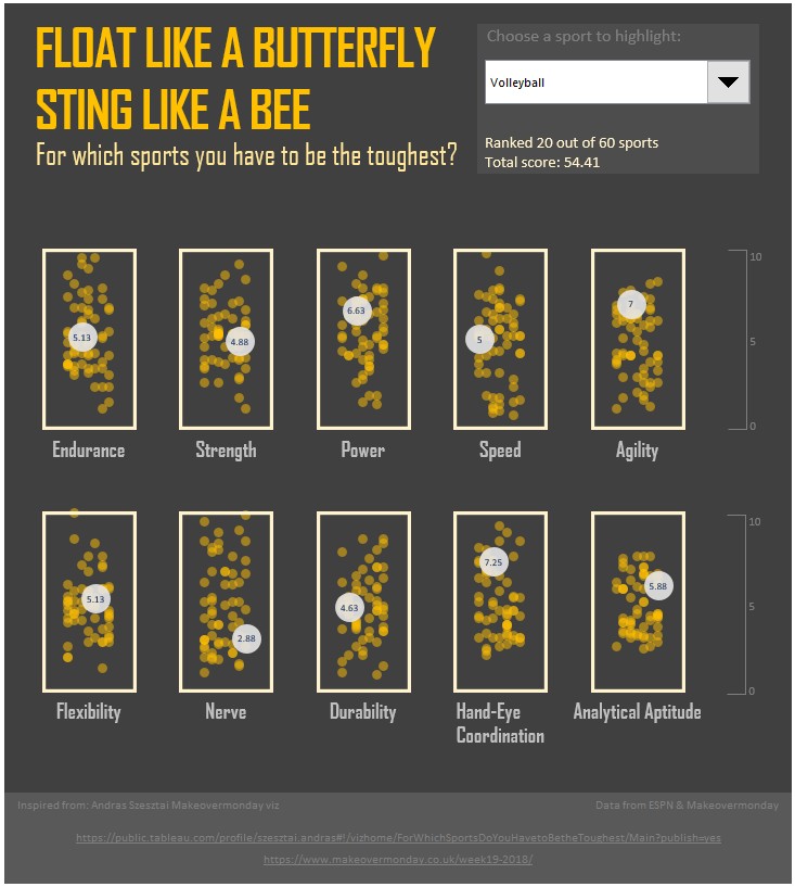
Chart 1: Scatter plot with random dots
Design by Andreas Szesztai (@)
Techniques used:
- Scatter plot with marker transparency and randomized position (jitter)
- Drop down form control for sport selection
- XY series for labels and boxes (shape as marker)
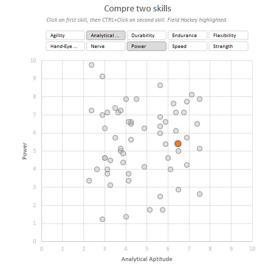
Chart 2: Scatter plot with skill comparison
Design by Mark Bradbourne (@)
Techniques used:
- Scatter plot with marker transparency
- Drop down form control for sport selection
- Slicers for skill comparison
Snapshots:


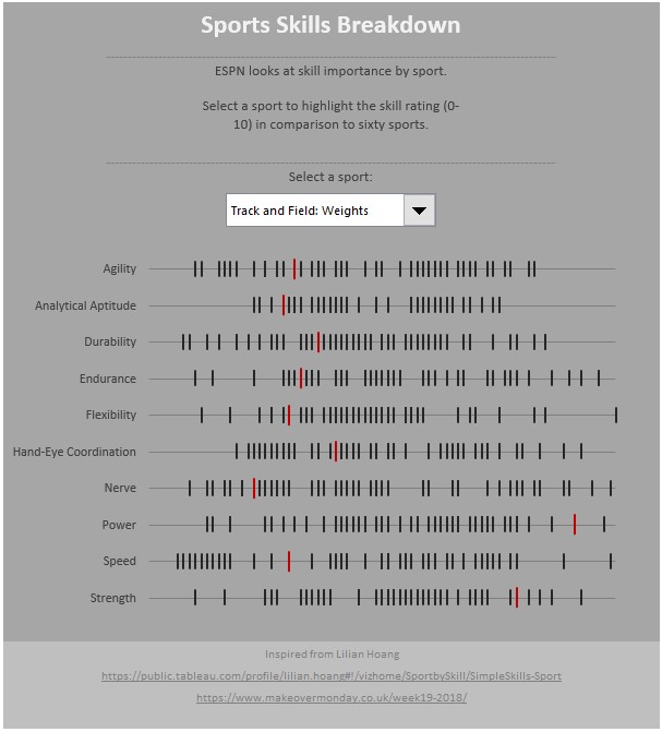
Chart 3: Bar code graph
Design by Lilian Hoang (@)
Techniques used:
- Scatter plot with line shapes for markers
- Drop down form control for sport selection
- XY series for labels
Snapshot:

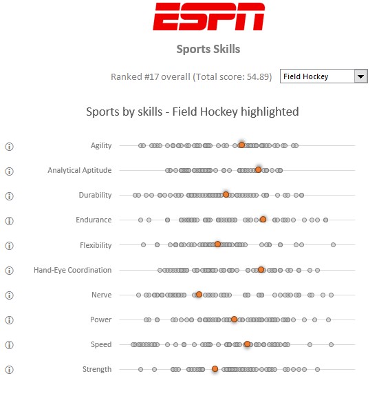
Chart 4: Scatter plot with random dots
Design by Nils Macher (@)
Techniques used:
- Scatter plot with shape transparency and jitter
- Drop down data validation for sport selection
- XY series for labels, grid lines for vertical lines
Chart 5: Table with conditional formatting
Design by Chandoo (@)
Techniques used:
- Excel tables for keeping data
- Conditional formatting data bars
- Form controls to show / hide values
- ;;; format code for hiding values
Chart 6: Which sports are similar to your sport?
Design by Chandoo (@)
Techniques used:
- Euclidean distance between sport skill values, same concept is used to find clusters in ML or Data Science.
- Data validation drop down for sport selection
- Panel charts and bar graphs with categories in reverse order
Download sixty sports in 6 charts workbook
Click here to download the workbook. It is beautifully presented and contains heaps of detail. I made liberal use of VLOOKUP, INDEX and occasional SUMPRODUCT along with one odd Power Query to reshape the data. Have a play with the charts. Check out the formulas and named ranges. Original data is in “Data” tab. Try making your own charts.
If you want to learn how to create such charts…
If you like these charts and want to learn how to create them, then consider joining in my online video class 50 ways to analyze data. I am adding 60 sports in 6 charts as new case study the class. You can learn how to go from raw data to beautiful charts like this in the class. Click here to know more & sign-up.
What is your favorite chart?
I like Chart #1 & 4. Of course, I had loads of fun building Chart #6 too. All in all it was a great exercise to recreate these charts in Excel and see what is possible.
What about you? What is your favorite chart? How would you visualize it? Share your thoughts (or charts) in the comments section.


