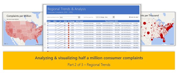
This is part two of our three part series on how to analyze half a million customer complaints. Read part 1 here.
A little background
How would you analyze data when you have lots of it? That is the inspiration for this series. We are re-opening enrollments to the 50 ways to analyze data program in a few days (on 24th of February, Wednesday). I want to share the process, techniques and visualizations you can use to analyze any business data with a case study. In this series of articles, let’s analyze fairly complex and large data set to derive insights.
Please join our Analytics Email Newsletter to get all three parts of this series and information about 50 Ways to Analyze Data program.
Analyzing Regional Trends
As introduced in part 1, our complaints dataset has geographical information too. We know the state & zip code for each complaint. Please note that zip codes are partial or missing for a 10% of the data.
In this article, let’s explore three ways to analyze regional trends.
- Regional trends by state, product & issue
- Complaints per million by state
- Complaints by zip code
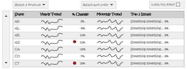
1. Regional trends by state, product & issue
First, we need to identify the goals for this analysis. You can define any number of goals for this data set. Let’s start with these goals,
- Understand yearly trend by state between 2012 & 2015 (we don’t have full data for 2011 or 2016)
- Explore 2015 monthly trend to understand patterns
- Understand top 3 issues bothering the customers
- Look at the trends at whole or by any individual product
- Don’t let bigger states hijack the report
- This means we need to index the data.
- Rearrange the report so we can focus on states that require most attention.
Feel free to add your own goals and analyze data to fulfill them.
Mockup for our visual analysis
Given the geographical nature of this data, we would be tempted to go with a maps based visualization. Unfortunately, maps tend to distort the data, as bigger states get more space. So for this analysis, let’s stick with good old tables, lines & dots.
Here is a mockup of the analysis we are trying to achieve.
From raw data to analysis – the journey
I will be honest here. The journey from raw data with 500,000 rows to the analysis we need is not an easy one. As I wanted to analyze this data with tools & features native to Excel 2010 (so that maximum readers can enjoy this), I had to say no to Power Pivot, VBA, Power Maps, Timelines etc.
What about formulas?
Using formulas like SUMIFS, INDEX, MATCH, VLOOKUP or SUMPRODUCT is also a no-no as we have too much data. So what to do?
Here is the process:
- Remove un-necessary columns from the raw data. We end up with just 7 columns (from 16)
- Create pivot tables from raw data
- Pivot 1 – Complaint count by Year, Month, State, Product
- Pivot 2 – Complaint count by Product, Issue, State for the year 2015
- Pivot 3 – Complaint count by Issue, State for the year 2015
- Build calculations that talk to pivot tables to fetch the numbers we want
- Define named ranges for the pivot table data, row & column labels so that we can easily access them in our formulas
- Get the numbers we need using GETPIVOTDATA, INDEX & SUMIFS
- Define form controls to capture user choices for product, sort order & indexed data
- Sort data by given criteria using LARGE formula
- Plug the calculations to output worksheet.
- Set up a scrollbar form control to show 12 states at a time, as we have limited space on the screens.
- Show trend using sparklines
- Show alert icon for states with >20% increase in complaint volume using conditional formatting.
- Tidy up the output
Regional trend analysis – final output
Here is the final output of the regional analysis report.

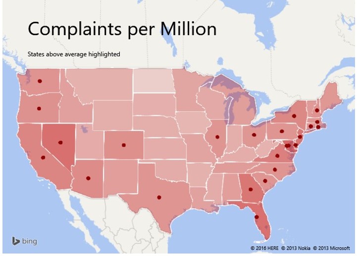
2. Complaints per million by state
Of course, as the data has geographical component, I am tempted to try some map based visualizations to analyze it. So for this & next type of analysis, I have used new Excel 2016 feature – 3D Maps (known as Power Maps in earlier versions).
If we chart the complaint data directly, bigger states (like CA, FL etc.) will hijack the map. So I downloaded 2015 population estimates (from Wikipedia) and combined this information to calculate a new metric complaints per million.
I created two map layers – one with complaints per million in 2015 & another to mark states with above average complaint rate.
Check out the visualization below. For more, download the 3D maps workbook.
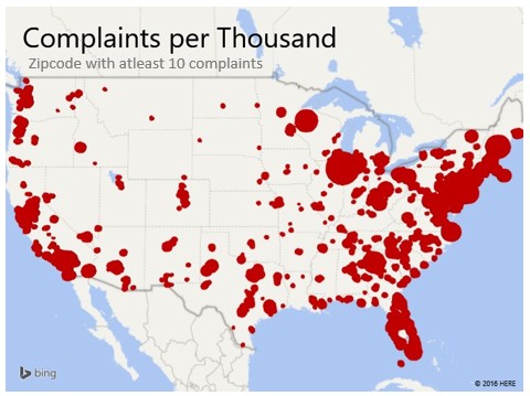
3. Complaints by zip code
While many of us think zip codes are actual geographical regions (ie polygons), they are not. They are simply postal routes. So gathering population by zip code is hard. Fortunately, I found a Population by zipcode – 2010 – dataset here. It is for year 2010, but the data is a good proxy for our analysis.
In our dataset, zip code data is not available for roughly 10% records. So I eliminated them and analyzed the rest. When calculating the complaints per thousand metric, I noticed another anomaly. Certain zipcodes have very little population (~ 3,000 zipcodes have less than 500 people). So if they have even 1 complaint in 2015, their CPT (complaints per thousand) will be very high.
Here is the first visualization – Complaints per thousand by Zipcode
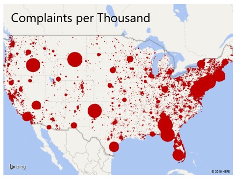
To avoid the too little population problem, I have applied a filter in 3D maps so that if a ZIP code has less than 10 complaints, we don’t show them on the map.
Here is the second visualization
Quick demo of the visualizations
In case you are unable to download the files or want to just peek at these awesome visualizations, see below video.
You can also see this on our YouTube Channel.
Download the workbooks
There are two workbooks for this article.
- Regional trends dashboard – compatible with Excel 2010 or above
- Regional trends maps – Opens in Excel 2016 (2013 with Power Maps, but not tested)
How would you analyze the complaint data?
Go ahead and play with this data yourself. How would you analyze it? Please share your ideas, analysis & charts in the comments section. If you wish to publish a chart, email it to [email protected] with the subject “Half a million complaints”. I will add your chart at the end of this post.
Sign up to receive remaining two parts & more…
If you like this and want to learn more about data analytics, understand how our 50 ways to analyze data program can help you, sign up for our course newsletter. Please click here.


