Today, lets talk about an interesting extension to the idea of in-cell charts. Adding average or target markers to the chart.
Here is what we are going to create:
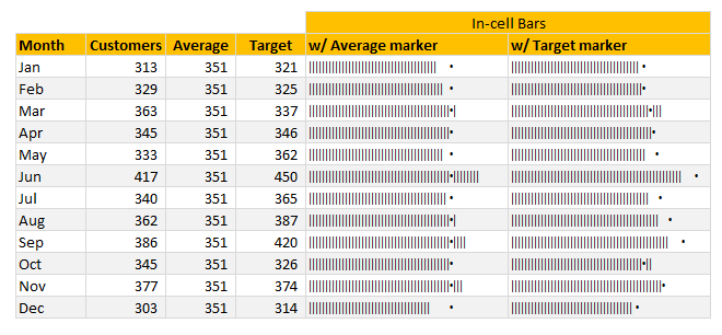
PS: this chart is inspired from an email from Brian Coetzee.
In-cell what? A quick re-cap
If you have never heard about in-cell charts, read this quick re-cap section.
In-cell charts are light weight charts generated to fit inside a single cell. Example in-cell charts are
- sparklines
- conditional formatting data bars
- bar charts generated with REPT formula.
First 2 options are very straight forward. It is (3) that is exciting because it opens up a lot of possibilities for us. See below, an introduction to in-cell charts.
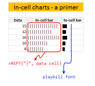
For more on in-cell charts, refer to resources section at the end of this article.
In-cell charts with markers – how to?
Adding a marker (like average or target or last year value) can enhance your charts greatly and provide more context. Lets understand how to add marker symbols to in-cell charts.
For simplicity sake, assume that,
- A1 has data value
- B1 has average value
Now, the marker can be in 2 places.
- Inside the bar
- Outside the bar
The basic formula for generating an in-cell bar with markers is,
=IF(A1<B1, REPT("|", A1) & REPT(" ", B1-A1) & ".", REPT("|", B1) & "." & REPT("|", A1-B1))
How does this formula work?
First we check if we should print the marker outside the bar or inside the bar with IF(A1<B1 portion.
Then, if we need to print the marker outside,
REPT("|", A1) & REPT(" ", B1-A1) & "."
- Print | symbol A1 times
- Print SPACE (B1-A1) times
- Print the marker symbol
Else
REPT("|", B1) & "." & REPT("|", A1-B1)
- Print | symbol B1 times
- Print marker
- Print | symbol A1-B1 times
Download in-cell chart template
Click here to download example workbook. It contains in-cell charts with markers. Play with the formulas to learn more.
More resources & examples on in-cell charting
Don’t keep your cells empty and boring. Load them with impressive analysis & charts. Learn from below resources.
- In-cell bar charts, revisited
- Use playbill to make better in-cell charts
- Murders vs. Suicides – Interactive chart
- In-cell charts + pivot tables
- Survey results – in-cell dotplot
- In-cell sales funnel chart
Do you make in-cell charts?
In-cell charts are one of my favorite charting techniques in Excel. I use them often in my reports or dashboards, when I want something quick & light-weight. They are easy to make & can look super awesome when you sprinkle a bit of conditional formatting on top.
What about you? Do you create in-cell charts? What are your favorite tips & techniques for working with them. Share your thoughts in comments.