Here is an interesting chart from Economist, ironically titled The weight of the world. Can you tell what is wrong with it?
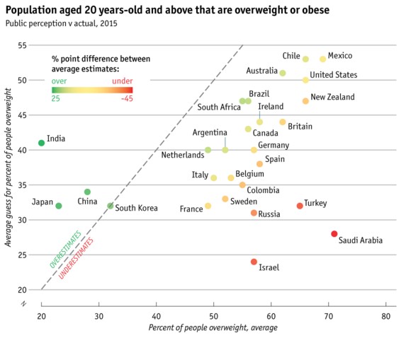
That’s right. The coloring of dots is unnecessary. The color scale dots add an extra layer of complexity to the chart. They are redundant.
So there you go. A simple but effective rule. Don’t add redundant colors or extra layers to your chart. Your users are smart, so let them decode the chart.
Make awesome charts every time…
Check out these additional charting principles and case studies to make awesome charts.
- How countries spend their money – chart alternatives
- Give your charts descriptive titles
- Data to Ink Ratio – understand and use it to your advantage
- Change stubborn opinions with charts
- A better chart to visualize best places to live


